From across the harbour the sails of the Sydney Opera House look plain white. Up close they are not. The shells are covered in 1,056,006 tiles laid in a chevron pattern, and they come in two finishes, a glossy white and a matte cream. The tiles were made in Sweden by Höganäs, a firm that until then had mostly made stoneware for paper mills, and Jørn Utzon worked with them for about three years to get the tile right: 120 millimetres square, clay with crushed stone in it, after a grain he had admired in Japanese ceramic bowls. Seen from a ferry, the two whites add up to one bright roof that still has some softness in it.
Codigrate's Sydney theme is the harbour at midday, and it starts from the same idea: more than one white. What follows takes it apart color by color. It is the eighth city in this series after Miami, Istanbul, Paris, Rio de Janeiro, Tokyo, Tallinn and Prague, and the fourth premium theme after Ocean, Salda and Prague.
A Harbour At Midday
The theme's own description sets the scene: Sydney Harbour at midday, from the white sails of the Opera House to the sandstone glowing along the shore, airy white and pale mist backgrounds with harbour blues, jade teals and outback golds. The palette names read like a ferry ride. Sail White, Opera White, Harbour Mist, Bondi Shallows, Grey Gull, Harbour Blue, Reef Blue, Pacific Blue, Tasman Teal and Ocean Ink are the water, from the foam to the deep channel. Jade Bay sits where the water turns green over the rocks. Peach Shell, Bondi Sand, Outback Gold, Desert Clay and Outback Copper are the land.
A deep teal #08637F is the accent of the interface, used for links and the small marks that need to stand out, with a Pacific blue #0F91C7 as its second accent. In the code, a harbour blue #2E89A6, a deeper harbour #2F6781 and a reef teal #0290A3 carry the water, and a desert clay #BA7347 and an outback gold #AF8427 carry the shore.
The Harmony: Harbour Against Sandstone
On a wheel, Sydney has two groups and very little in between. The cool group is an analogous sweep from jade to harbour blue: parameters at 164 degrees, annotations at 170, JavaScript member functions at 175, fields and methods at 187, the keywords and every background at 195, and the strings at 199. The warm group is the sandstone, a short arc from 23 to 45: desert clay locals, a sandstone for tags, outback gold for statics and globals, ochre for attributes, and the comments at the far end of it.
The two groups face each other. The opposite of the harbour blue at 195 is 15, and the desert clay at 23 sits almost there, so the theme is close to a complementary pair: the water and the stone it is cut into. It is the view from the Rocks at noon, a blue harbour below and warm yellow blocks of the old town around you.
Backgrounds, Two Whites And The Water
Sydney's backgrounds step from white to a real blue:
- Input #FFFFFF, sail white, the one pure white, used for search fields and text boxes: the glossy tile.
- Editor #F6F9FA, opera white, a white with a breath of harbour blue in it, the page the code is written on: the matte one.
- Window #CAE4EC, harbour mist, for the tool windows and panels.
- Surface #73B9D0, harbour blue, for the outer frame the whole window sits in.
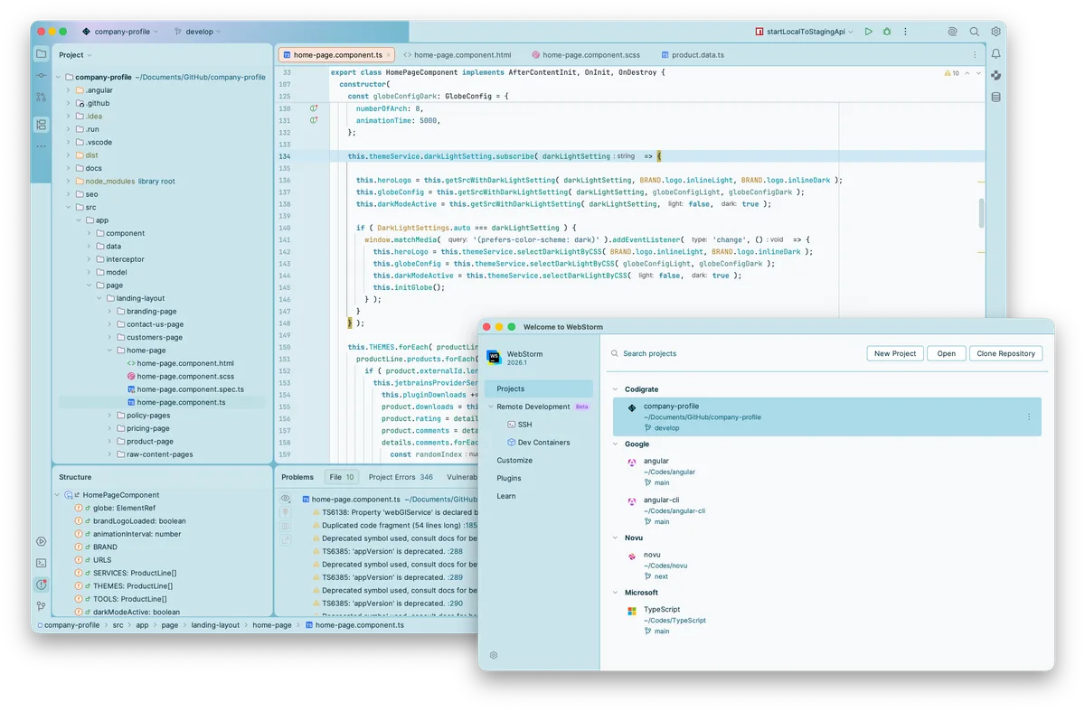
The frame is a true blue, at about 2:1 against the editor, so the code sits in it like a white sail on the water instead of disappearing into a field of near whites. The gutter goes back up to an almost pure white #FEFEFE, the current line is marked by a pale shallows blue #CEE8F3, and a selected row in the project tree is Bondi shallows #ABDAE8 edged in reef blue #169DC5.
The warm colors come in where the window tells you something. Selected text in the editor turns a sandstone cream #ECE7D1, the one warm white in the theme. The active editor tab sits on a peach shell #FAE5D9 with an outback copper underline #D17F51. Search matches are Bondi sand #ECD268 in the tool windows, and in the editor an outback brown #7C6A24 on a pale sand #F8F1D9. The word under the caret is the one place the bush comes down to the water: a eucalyptus green #2A6C04 on #E1F4D6 where it is read, and a deeper green #04770E on #D2F1D4 where it is written.
One Foreground, Several Voices
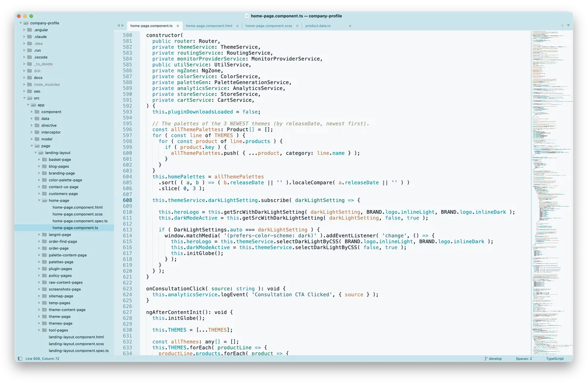
Code is written in a deep harbour ink #05242E at about 15:1 against the editor, and class names, function names and constants stay a near black #131B25 at about 16:1. The interface uses ocean ink #062E3A, the same blue gone almost black, and one level down a Tasman teal #0E5E76 for hints and secondary labels.
Comments are a sandstone grey #9C9378 in italics, at about 2.9:1, the quietest text in the theme. In a bright room a pale warm grey on white reads as a note in the margin, and that is how Sydney treats them: you read past them until you want them. If your files lean heavily on comments, this is the one place the theme asks you to look a little harder, a trade made to keep the page calm, the same ladder as in the readability post with the bottom rung set low.
The gutter is the water again. Line numbers are a grey gull blue #6D9DAC, the number on the current line darkens to a deep Tasman teal #1D6076 at about 6.7:1, and the caret is a harbour slate #42798E.
Syntax: Water, Reef And Sandstone
Open a file and the harbour fills in:
- Keywords in bold harbour blue #2E89A6, at about 3.8:1, with the weight doing what a darker shade would otherwise have to.
- Strings, numbers and escapes in a deeper harbour #2F6781, the darkest syntax color at about 5.9:1, the deep channel where the ferries run.
- Instance fields and methods in reef teal #0290A3, and JavaScript member functions in a greener teal #038E82.
- Parameters in a deep jade #177A60 at about 5:1, and annotations in jade bay #2F9383, the water over the rocks.
- Local variables in desert clay #BA7347.
- Static fields and methods in outback gold #AF8427, global variables in a close gold #B38631, and attributes in a brighter ochre #B58B22.
- Tags in sandstone #C18C47, set in bold for HTML and XML tag names.
Every colored token sits between about 3:1 and 6:1, much lighter than the ink around it. That is what lets Sydney stay airy. The near black names and the deep ink of plain text hold the shape of a file, so the blues, teals and golds can stay as soft as the harbour on a clear day and still be told apart by hue.
The Final Product
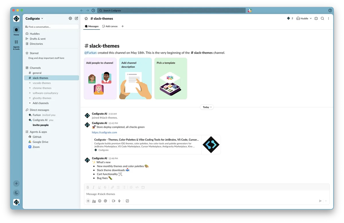
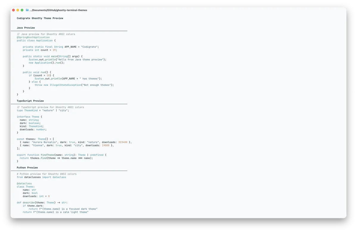
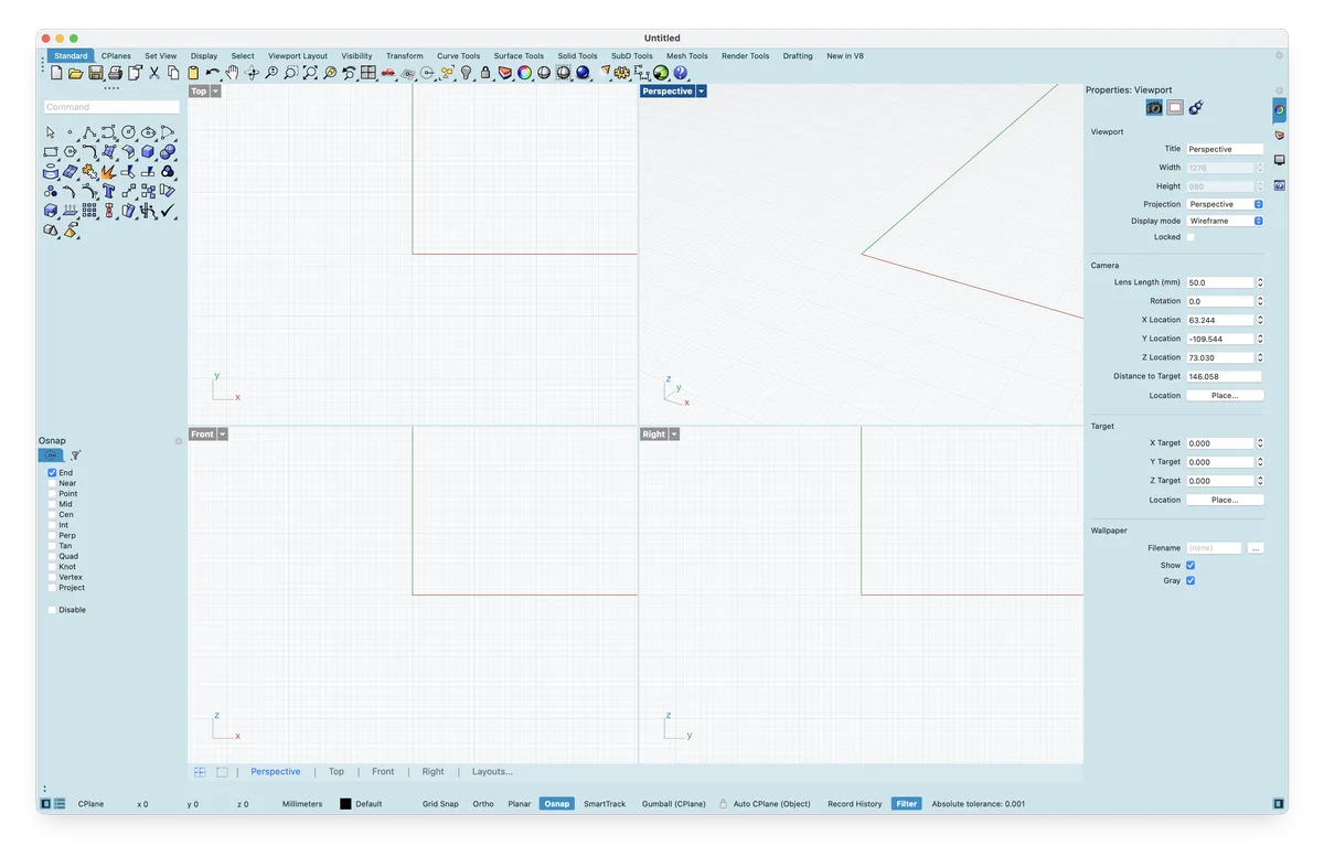
Here is Sydney put back together. Harbour mist frames a JetBrains IDE and Sublime Text, Slack and Ghostty keep the same pale blue around the chat and the shell, and in Rhino the viewports stay a clean opera white with the panels around them in mist.
Explore Our Themes
Reading It Back
Taken apart, Sydney is a harbour seen from the stone above it. Two whites carry the page, a soft opera white for the code and a pure sail white only where you type, inside a frame of harbour mist and harbour blue. The water side of the wheel carries the keywords, the values, the members and the parameters; the sandstone side carries the locals, the statics, the globals, the attributes and the tags. The marks that tell you where you are come in warm, a cream selection and a copper tab, and the comments step far back into a sandstone grey.
It is a theme for a bright room and a long day, which is when the real harbour looks most like this, the sails white against the water and the ferries crossing below. Sydney is a premium theme: a paid plugin for JetBrains IDEs on the JetBrains Marketplace and part of the All In One bundle, a one time purchase for Sublime Text, Ghostty, iTerm2, macOS Terminal, Slack and Rhino from the Codigrate store, and a LINE theme in the LINE theme shop, all from its theme page.
Frequently Asked Questions
What is the Sydney theme?
Sydney is one of Codigrate's premium light city themes, built around Sydney Harbour at midday: the white sails of the Opera House, pale blue water full of ferries, and the sandstone of the shore warming in the sun. The editor is a soft opera white, the panels around it a harbour mist and a harbour blue, and the code splits between the water and the land: harbour blues and reef teals for keywords, strings, members and parameters, and desert clay, outback gold and sandstone for local variables, static members, attributes and tags.
Why does Sydney use two different whites?
For the same reason the Opera House roof does. Its shells look plain white from the water, but up close they are covered in a chevron of glossy white and matte cream tiles. Sydney does the same on screen: the editor is an opera white #F6F9FA with a breath of harbour blue in it, the soft one you look at for hours, and only the input fields and the gutter go to a pure white, so the place you type is the brightest spot in the window. Selected text turns a sandstone cream #ECE7D1, the one warm white in the theme.
How are the syntax colors chosen in Sydney?
They sit on two sides of the wheel. The cool side, between 164 and 199 degrees, is the water: bold harbour blue keywords, deeper harbour blue strings and numbers, reef teal fields and methods, and a deep jade for parameters. The warm side, between 23 and 45 degrees, is the sandstone shore: desert clay for local variables, outback gold for static members and globals, ochre for attributes and a sandstone for tags. Class and function names stay a near black ink, which carries the structure so the colors can stay as soft as the harbour.
Where can I get the Sydney theme?
Sydney is a premium theme. On JetBrains IDEs it is a paid plugin on the JetBrains Marketplace and is also part of the All In One bundle. For Sublime Text, Ghostty, iTerm2, macOS Terminal, Slack and Rhino it is a one time purchase from the Codigrate store, delivered as a download, and the LINE version is sold in the LINE theme shop. All of them are linked from the Sydney theme page.
